

‘Upcycling’ the re-commerce platform 2dehands
Enhancing User Experience and brand consistency in the Homepage redesign
2dehands.be was established in Belgium in 1999 as one of the first classified ad websites in the country and is widely spread.
Visitors range from private individuals, small and large businesses.
It gets around 3 million visits per month and an average of 70.000 new listings posted per day.

Let’s hear it from the users
Interviews to understand their pain points and opportunities for the redesign
The look and feel of the brand
Emotionless | Functional | Outdated | There’s no beauty
The look and feel of the Homepage
Great chaos | Starts to frustrate, too many ads | Hard to know the difference between an ad and a listing | Difficult website | It doesn’t always feel safe
Other input
I want to be able to draw a map of the area where I want to look for items [instead of giving a postal code]
The uploading process is easy
Very often the phone recognises when a picture needs to be turned around but then 2dehands reverts that mechanism and there’s too many pictures in the wrong direction on the website
Interviews conducted in an informal environment on October 22nd 2025, with a sample of 4 people (3 men, 1 woman, between 37 and 75 years old, using desktop web version, mobile web version and app as touchpoints).
And let’s not forget the competition
Small benchmark (national and international platforms)


I want to see the UX/UI improvements
The logo as of now
First version
Current version

Idea behind the rebranding
Taking into account the small sample of interviewed users, we’re going for:

Functional

Reliable

Friendly
Without forgetting what is at the base of it

Circular Economy

THE CHALLENGE:
To represent circularity without using arrows
Sketches


Grid of the logo
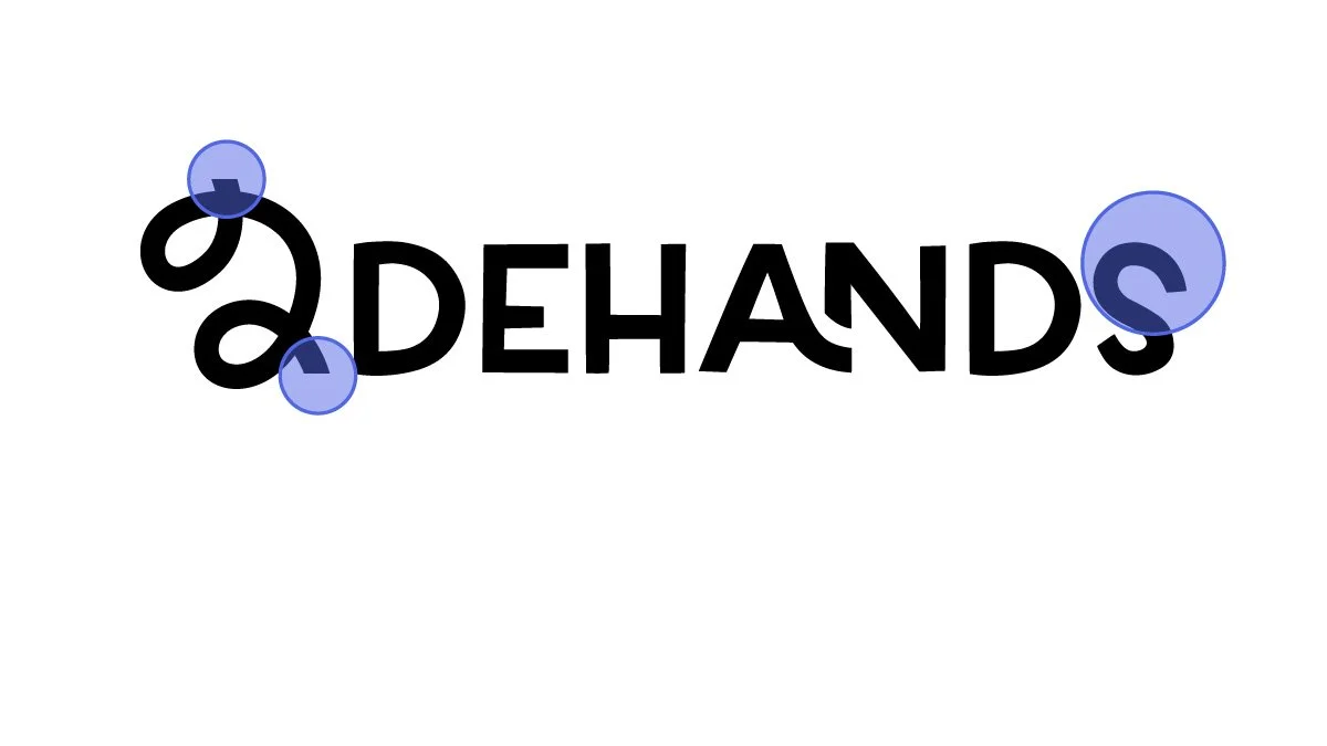
Straight lines to indicate ‘cut’ of a line that has continuity
Letter S would seem unbalanced on its own, but because the ‘2’ also has a larger upper body, the ‘S’ helps the logo feel more balanced
I want to see the UX/UI improvements

Color
Color contrast according to WCAG 2.0
Possible AAA color combinations

Possible AA color combinations (text above 19px)

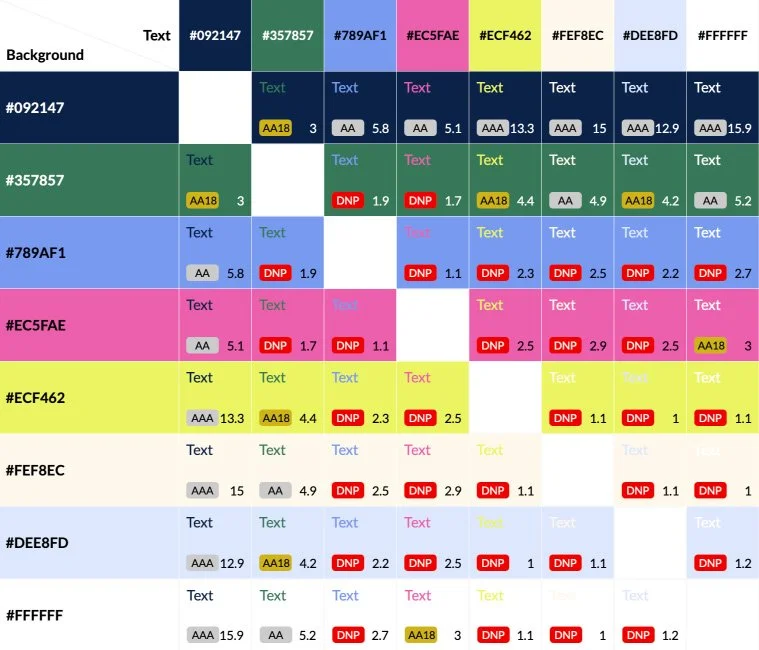
AAA Pass, AAA (7+)
AA Pass, AA (4.5+)
AA18 Pass, Large Text Only (3+)
DNP Does not pass

Typefaces
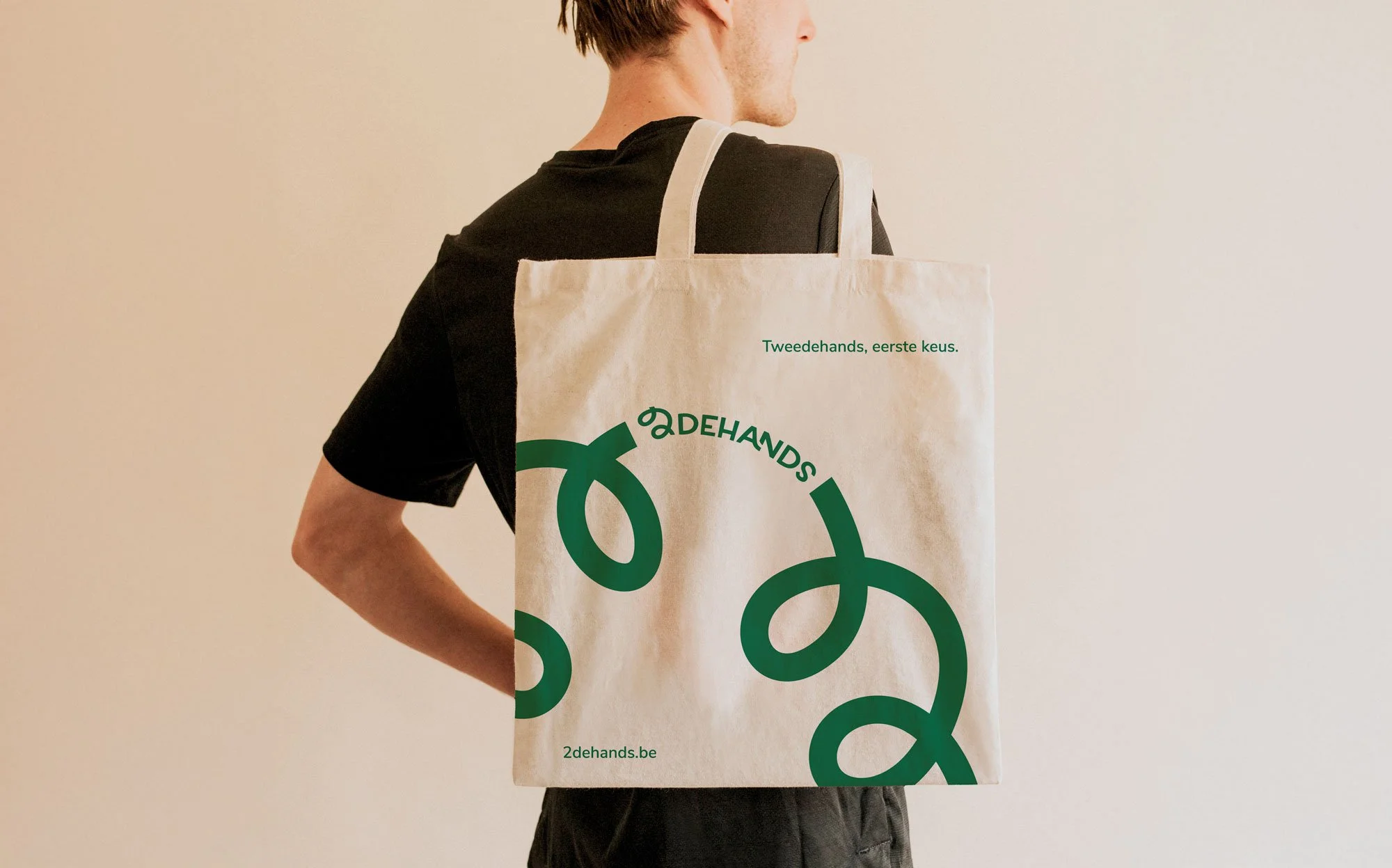
Tweedehands, eerste keus.
‘Second hand, first choice’ - the new slogan.
Homepage (desktop)
UX/UI
Issues I’ve identified through the lens of Heuristics
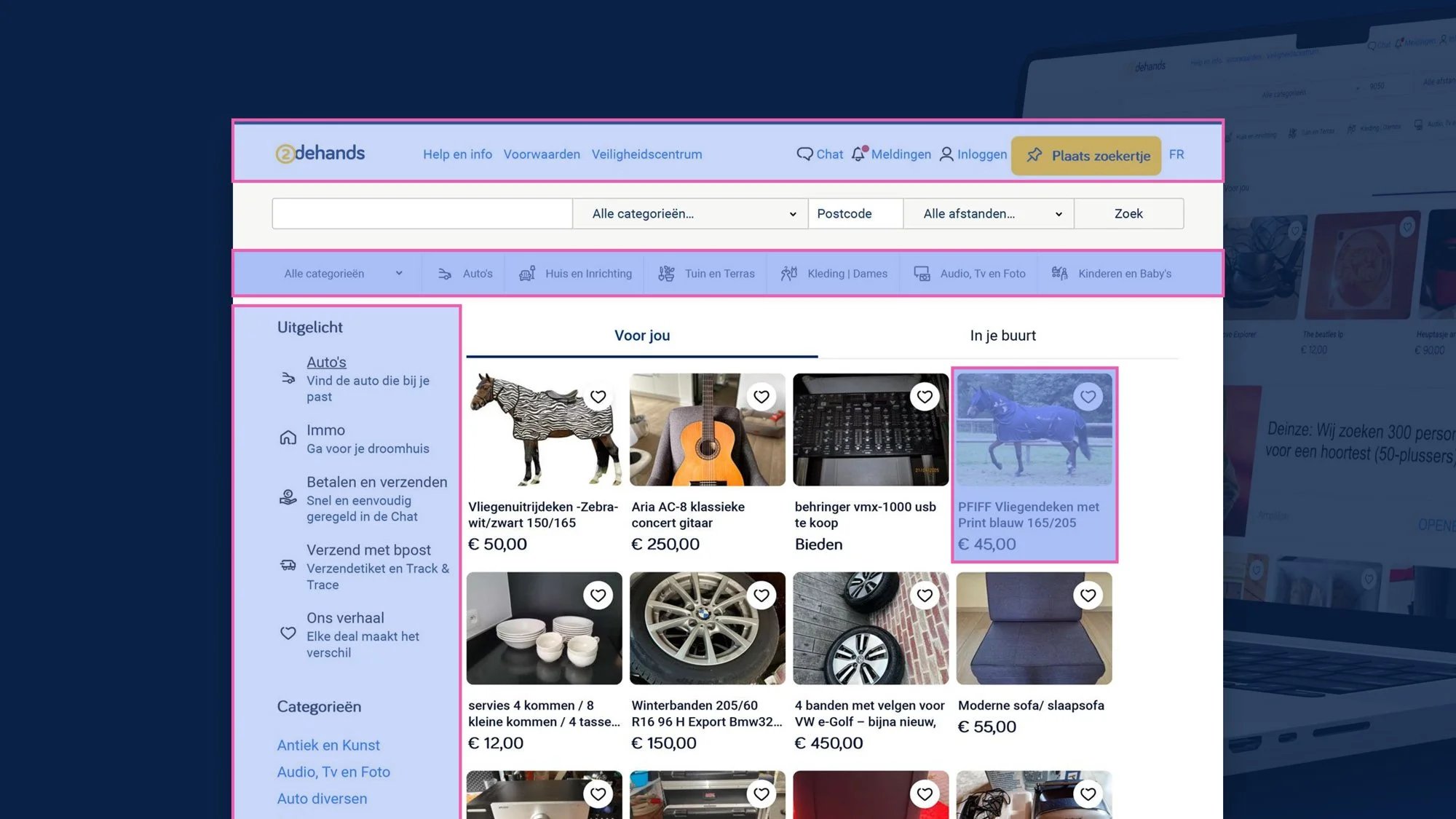
Menu
Too many interactive elements and little space between them
Need to rework categories
Different icons or even images
Understand the difference between different sections that show categories
Need to rework cards
Let’s give some more information
What I did
2dehands is the kind of platform that reaches every kind of user from the most different backgrounds.
I knew it wouldn’t be smart to change too much but I definitely wanted to simplify as much as possible and find the right place for all elements.
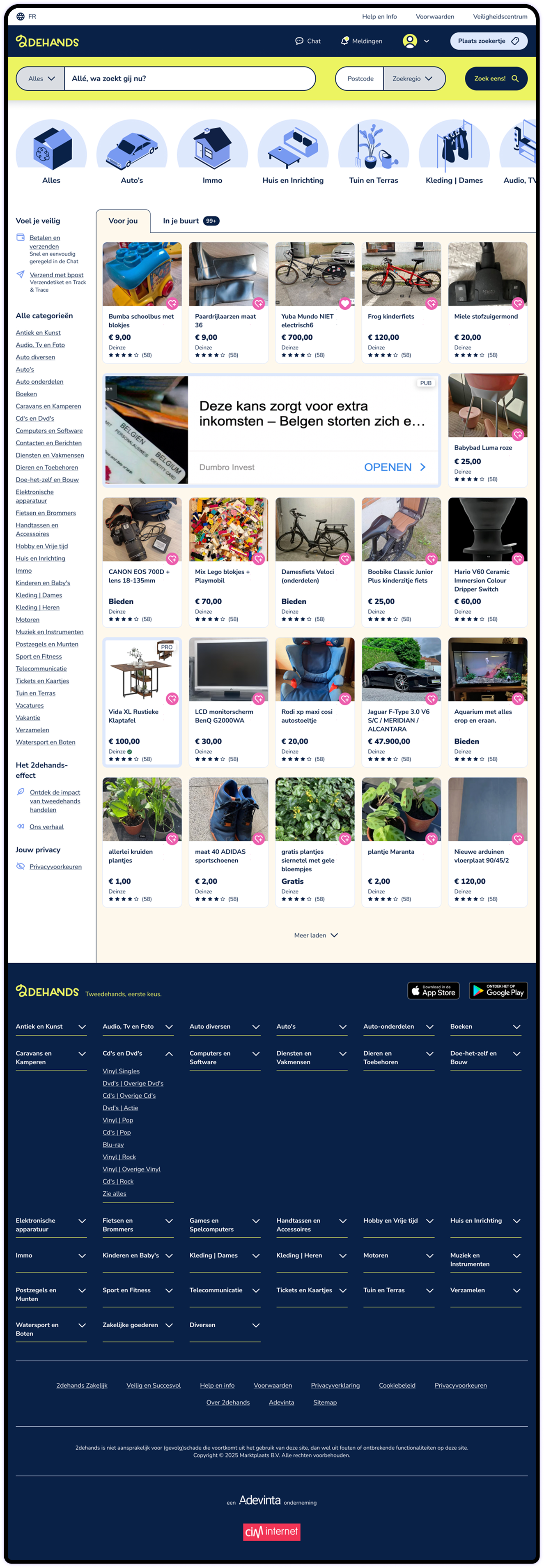
Made sure the initial viewport in 1440x768 and 360x640 showed the Menu, Search, Featured Categories, information that would make the user feel safer (Voel je veilig) and at least the first row of listings in Desktop and Mobile
Approached the UI as an invitation to interact, using mainly color to create that invitation
Worked the available information to create a layer of safety to the user, by giving them a section that addresses possible concerns (Voel je veilig) and by including information about the seller in the Listing Card
Listings and Ads have now subtle but relevant differences that hopefully will help users identify easily which is which
Reworked the footer to keep it useful but more compact
Navigation
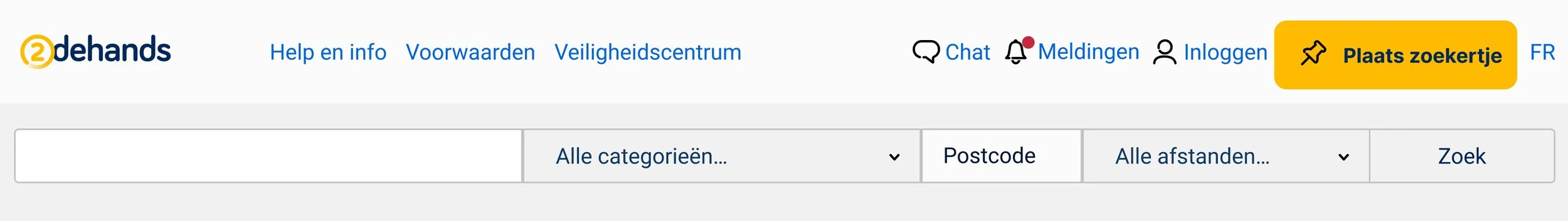
Before
After
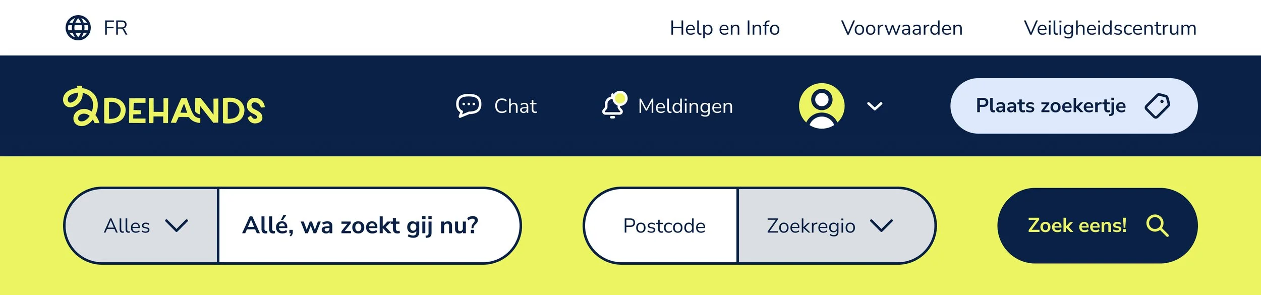
Menu bar is now divided in Top Bar and Nav Bar with an improved hierarchy of elements and with the Top Bar being clearly secondary
Interactive elements have now a hit area of at least 44px height to guarantee good contact area
All text has at least 16px of font size which improves readability
Elements in the search bar have now a gap between them, helping the user to identify the possible/expected interactions
Users are offered the possibility of drawing a map of their preferred “Zoekregio” (search area), while still letting them choose a postal code like they do now
“Allé, wa zoekt gij nu?” is a very informal way of addressing the user, that could be translated to “So, what are you looking for anyway?”
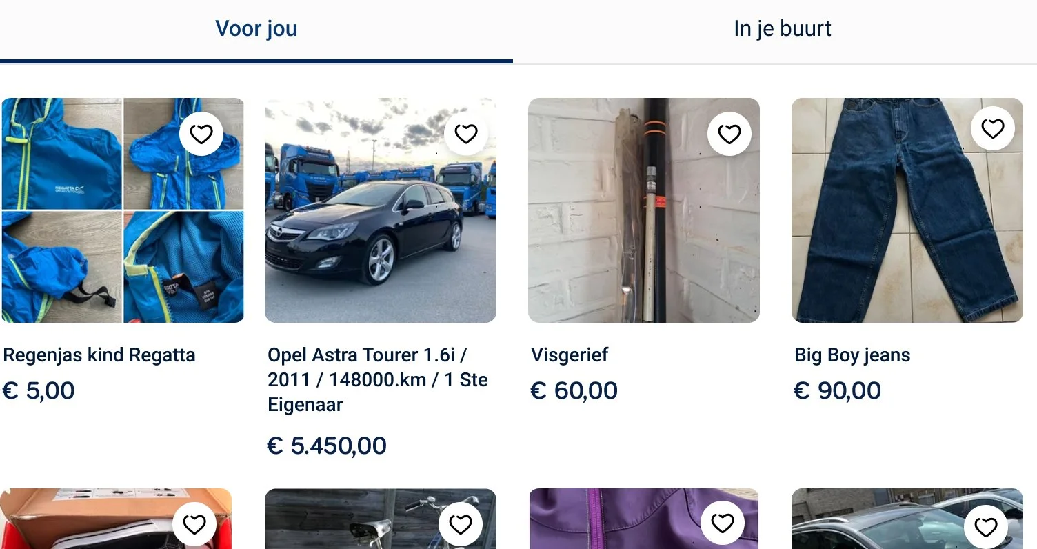
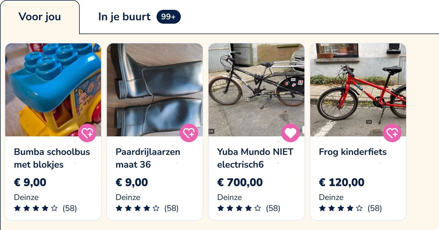
Tabs
Before
After
These are useful tabs, one of them with items related to my previous searches (“Voor jou”, which means For You) and another one with listings close to me (“In je buurt”, which means In your Neighborhood)
I kept the tabs but aligned them to the left (let’s not forget in Belgium we read from left to right)
The active tab has now a background color to give more visual context to the listings that are being shown. Since the color contrast was not enough to guarantee that visual context, I added a dark stroke
Categories
Before
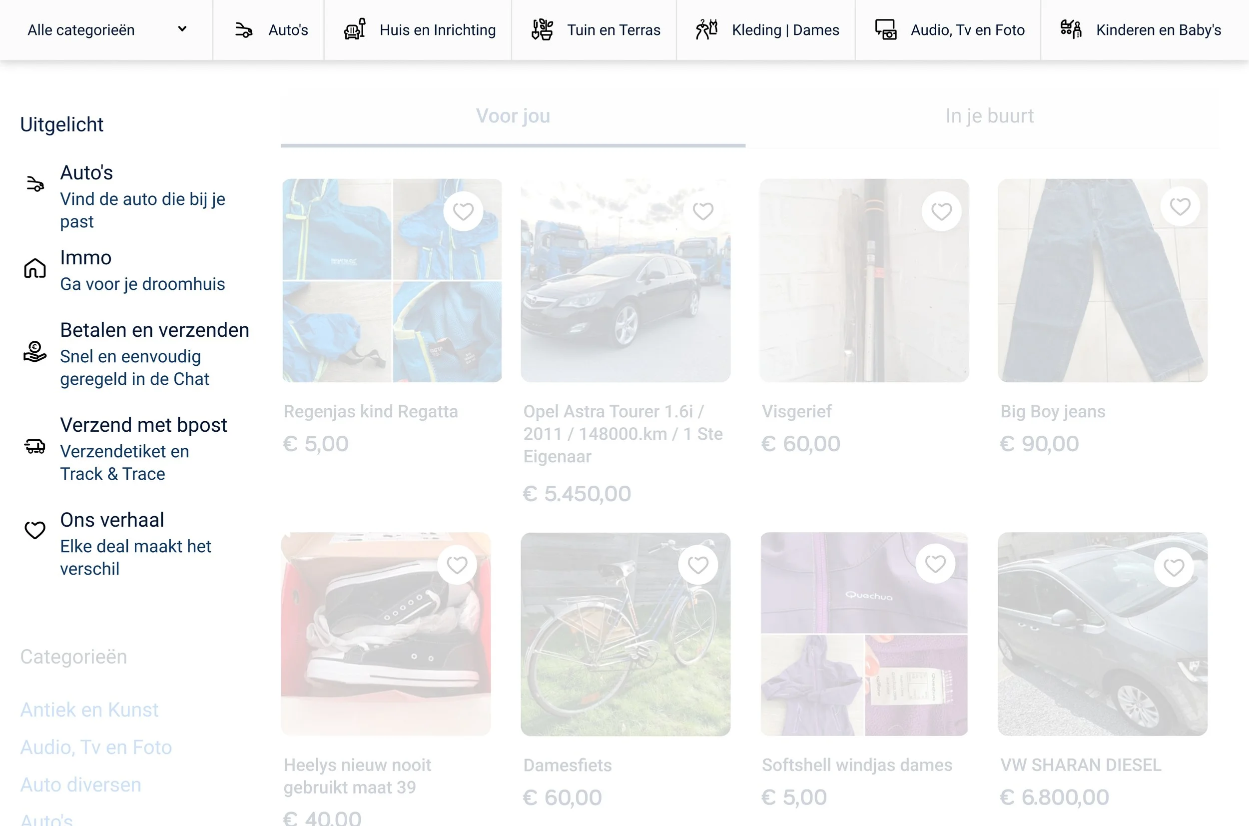
After
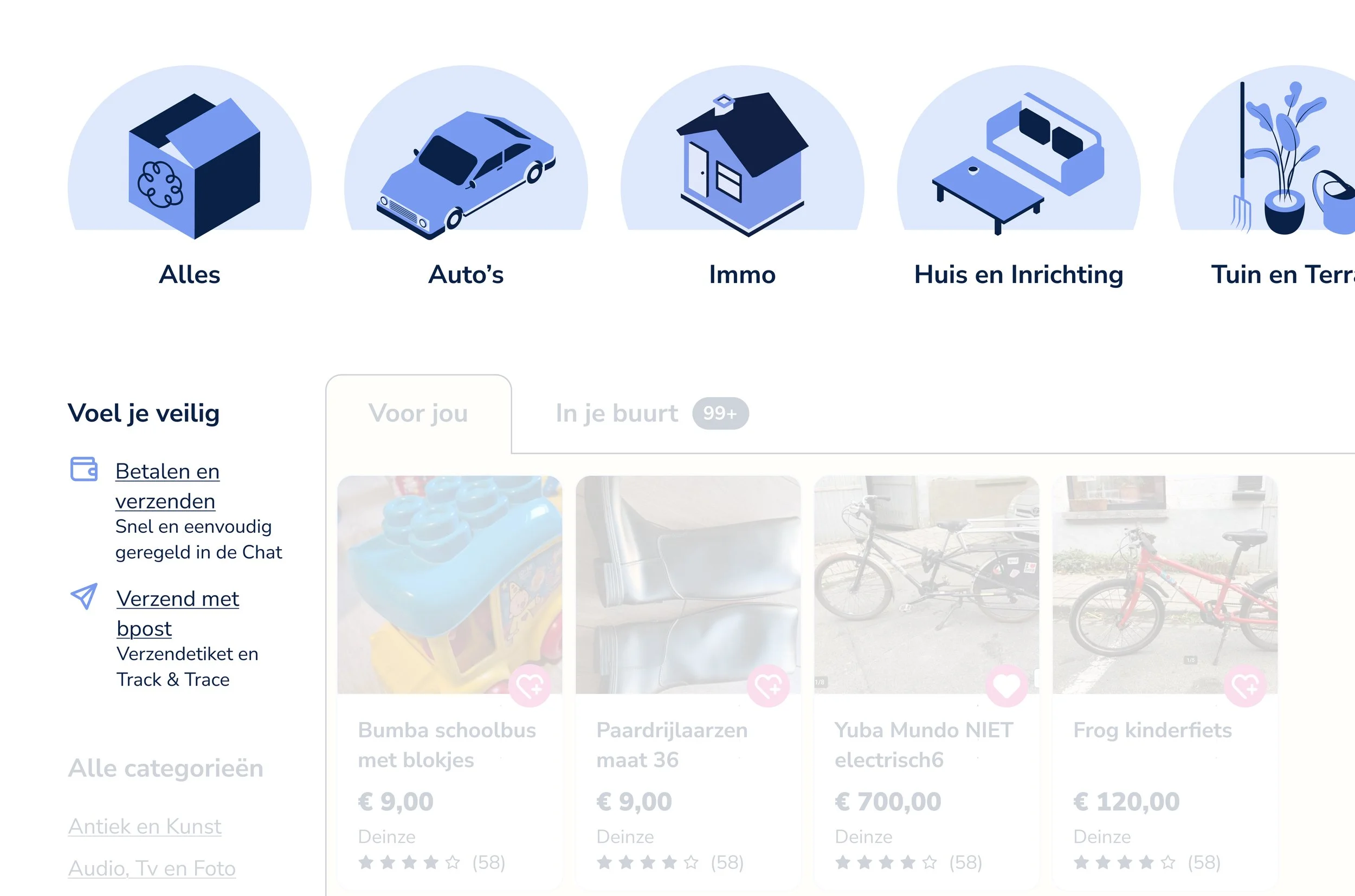
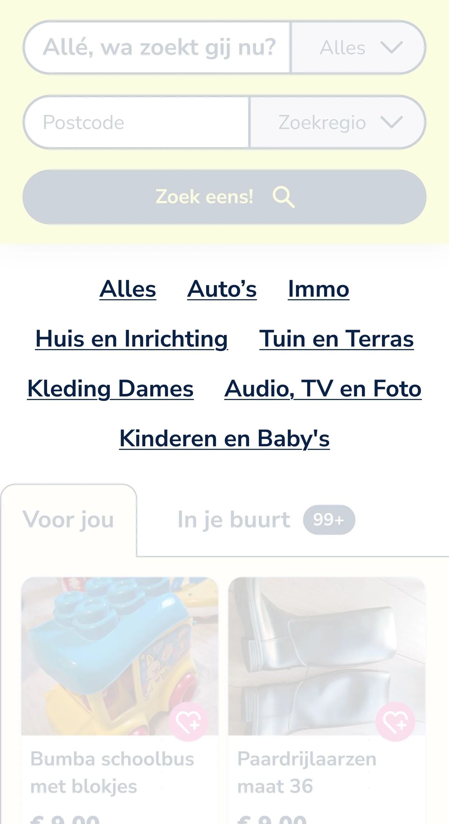
The featured categories earn a spotlight, with illustrations that make them easily recognisable and invite the user to click
Auto’s and Immo (Real Estate) were on the “Uitgelicht” section, but now disappear from there and show up in the Categories sections with illustrations
“Ons verhaal” (Our story) moves to a section under that already exists called “Het 2dehands-effect” (the second-hand effect)
“Uitgelicht” (featured) becomes “Voel je veilig” (feel safe) and includes the remaining information about payments, sending and tracking
In mobile, the categories loose the illustrations in order to save space and also because they couldn’t be large enough to shine
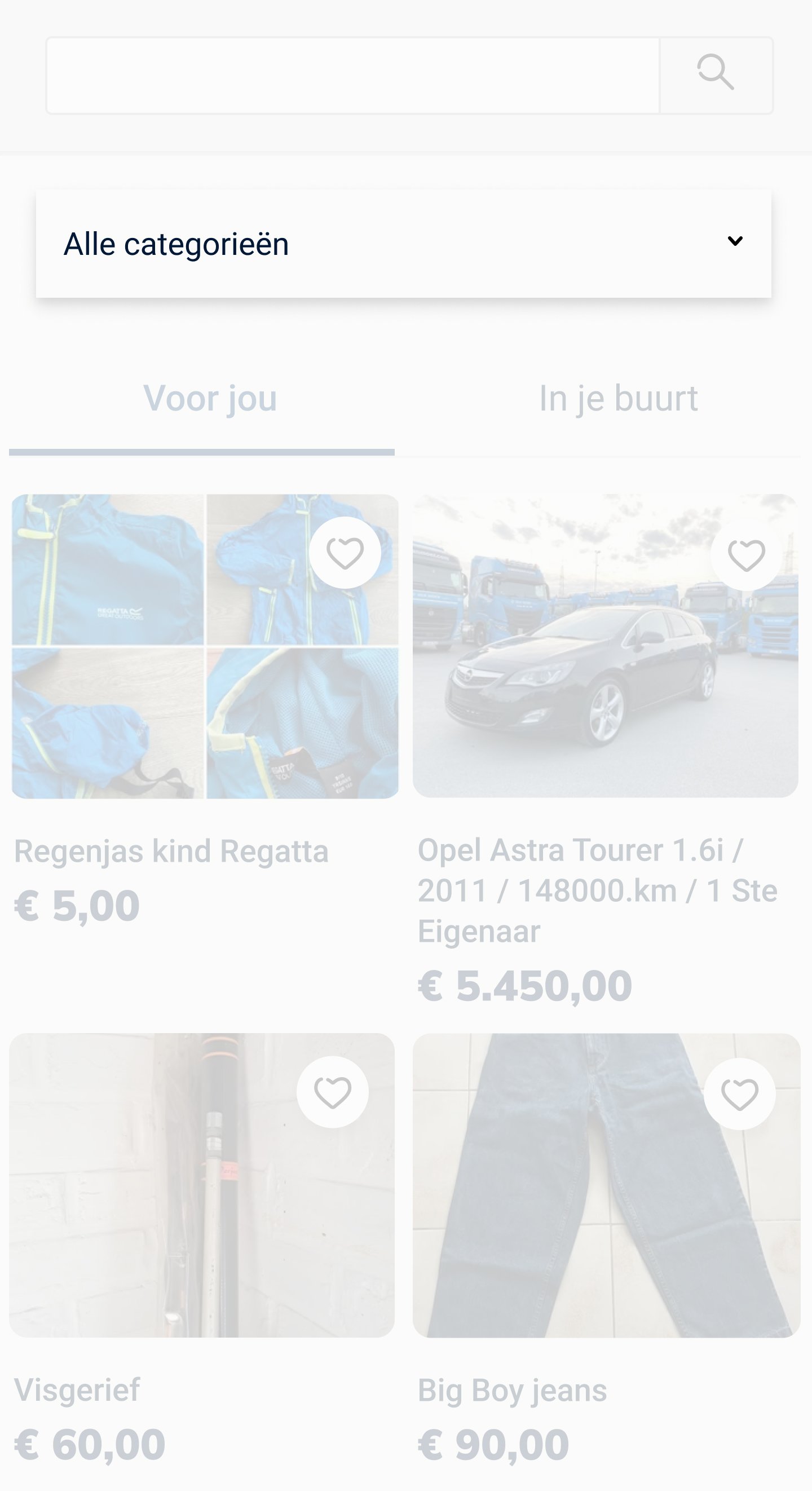
Listing Card
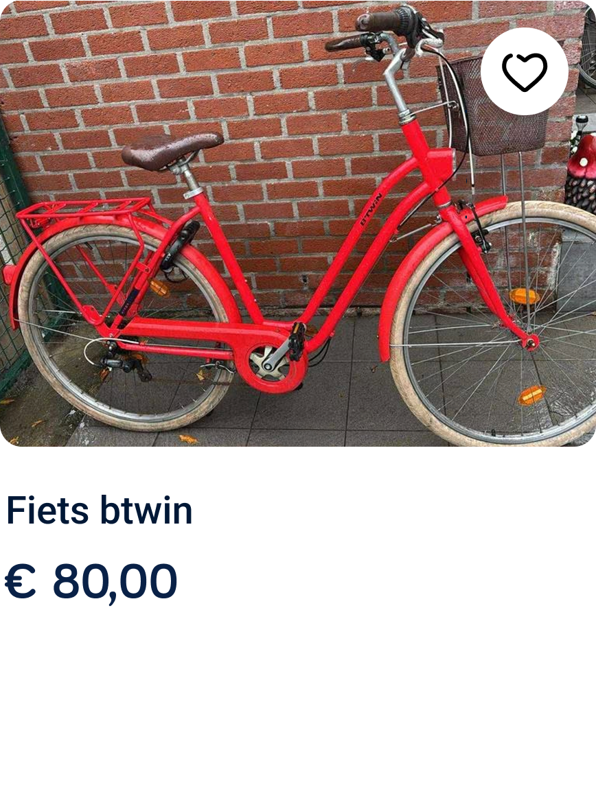
Before
After
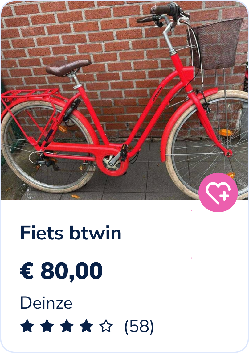
Title went from 14 to 16px
Price from 18 to 19px and bold
Improved padding in the text area and added white background
Rating of the seller shows up, to hold them more accountable and promote better sense of safety
Location also shows up, to prevent extra clicks to reach a simple, yet crucial, information
Behavior in a row
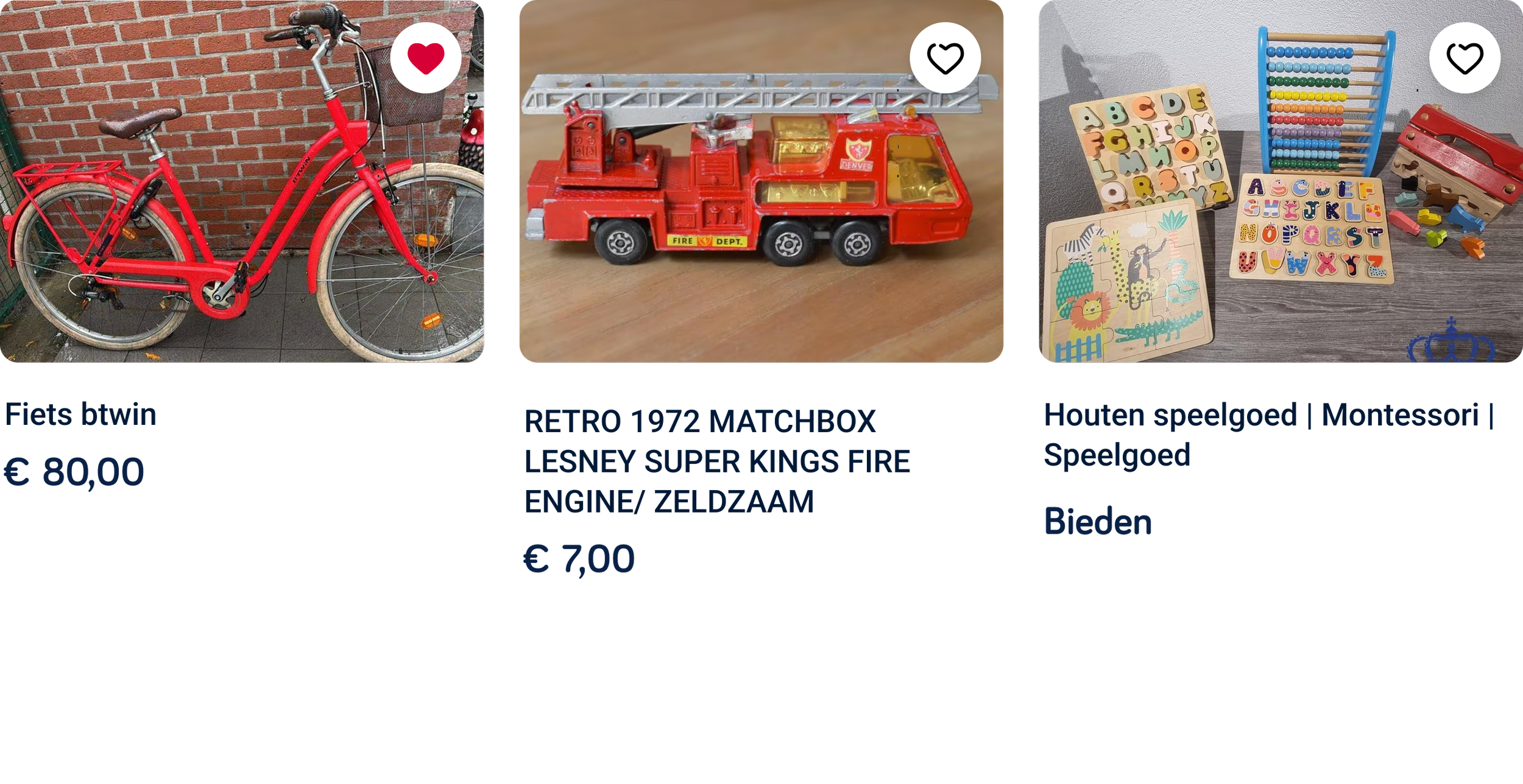
Before
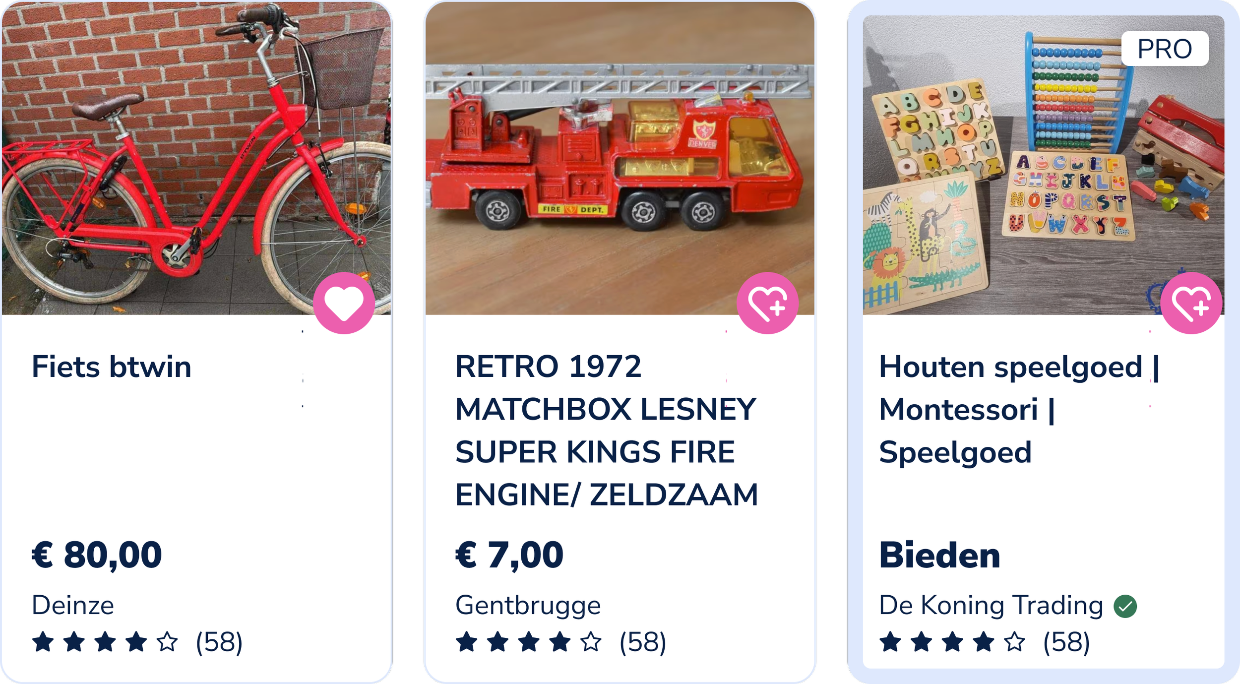
After
Price always at the same level
Difference between normal listing and professional listing is now very clear by having added a blue stroke, a “PRO” label, the name of the business profile instead of location (with verified symbol if that’s the case)
Footer
Before
After
Instead of having all categories and sub-categories visible, I added accordions that only show the sub-categories when clicked
Bots would still be able to read through the subcategories to improve SEO